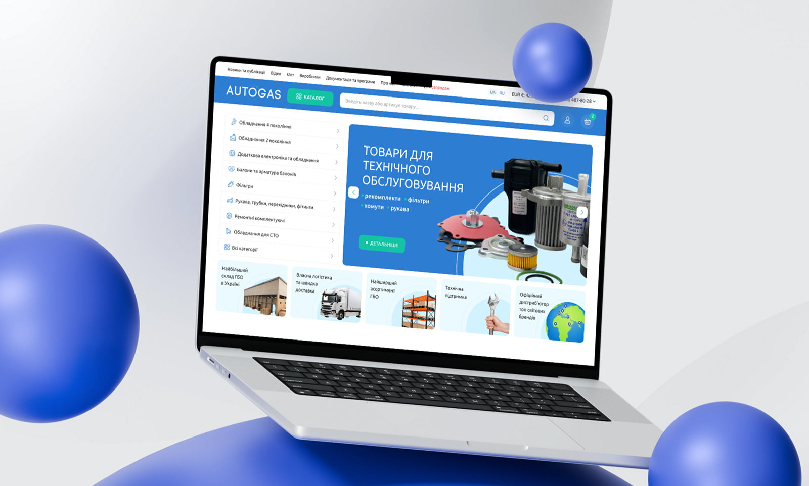
Visual concept:
– Developed a new color palette based on shades of blue and green—evoking eco-friendliness, clean combustion, and reliability. Instead of aggressive colors, the look is soft yet professional.
Logo rebranding:
– Simplified and refreshed the logo, making it adaptable while remaining recognizable to existing customers.
UX design for B2B + B2C:
– Considered different user scenarios (quick access for bulk orders / searching for individual parts);
– Improved filtering, sortings;
– Added logical navigation by brands and kits;
Interface details:
– Hover effects, animations, and microinteractions enhance engagement and bring the pages to life;
– Clear typographic hierarchy, strong contrast, and excellent readability.