I conducted an in-depth analysis:
– User scenarios (patients, doctors, pharmacists);
– Competitors in Ukraine and abroad;
– Modern UI solutions in the medical sector;
Based on this, I developed:
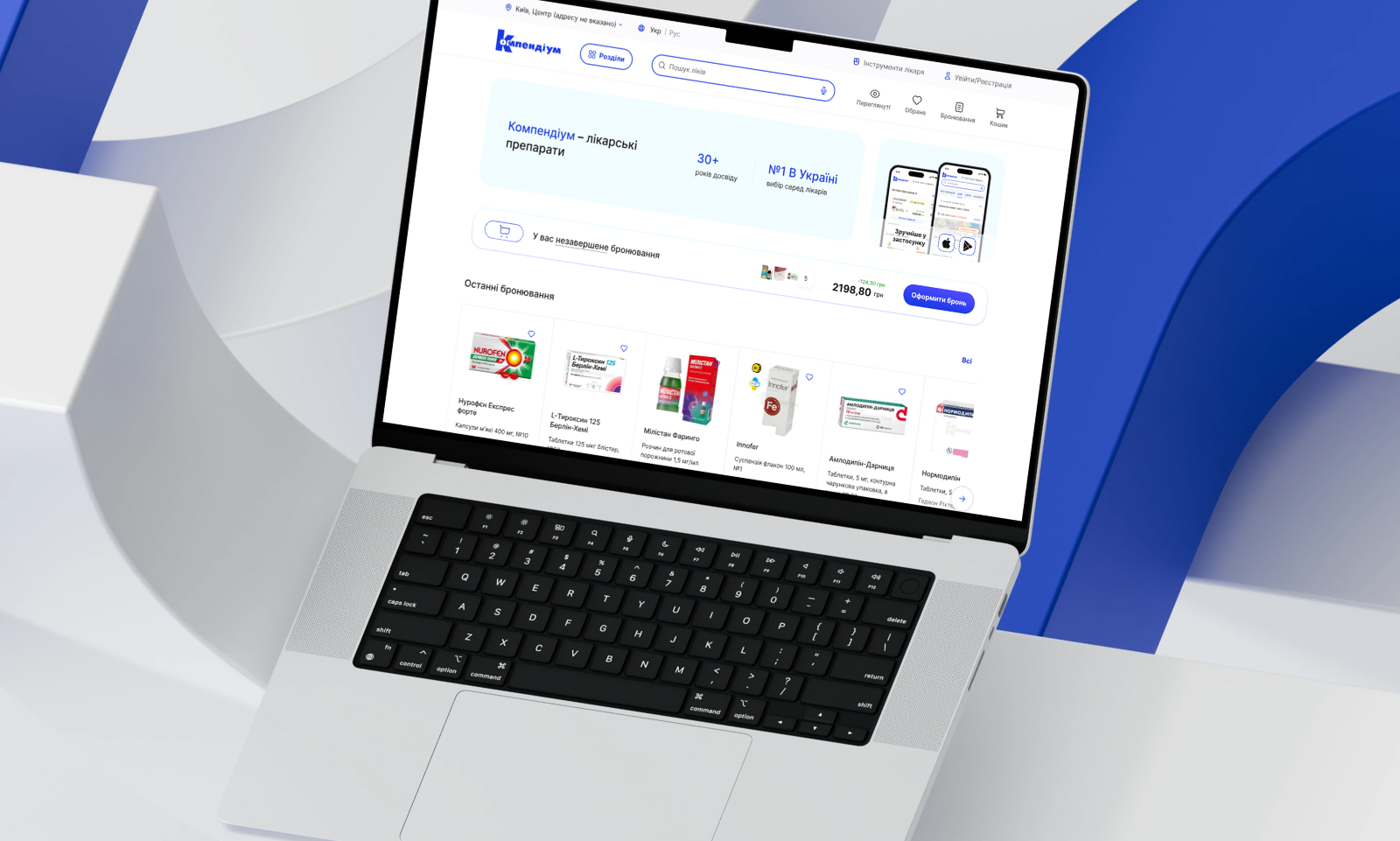
– A new navigation logic that minimized the steps needed to place an order;
– A reorganized drug card layout—keeping all essential information visible: dosage form, alternatives, instructions, and pharmacy availability;
– A clean, sterile design with a distinctly medical visual language: light tones, a sense of airiness, and color accents used only where action is required;
Visually, I crafted a completely new concept that respects the corporate identity while avoiding the “aging” of the visual language.
UX focused on simplicity and predictability for the user.