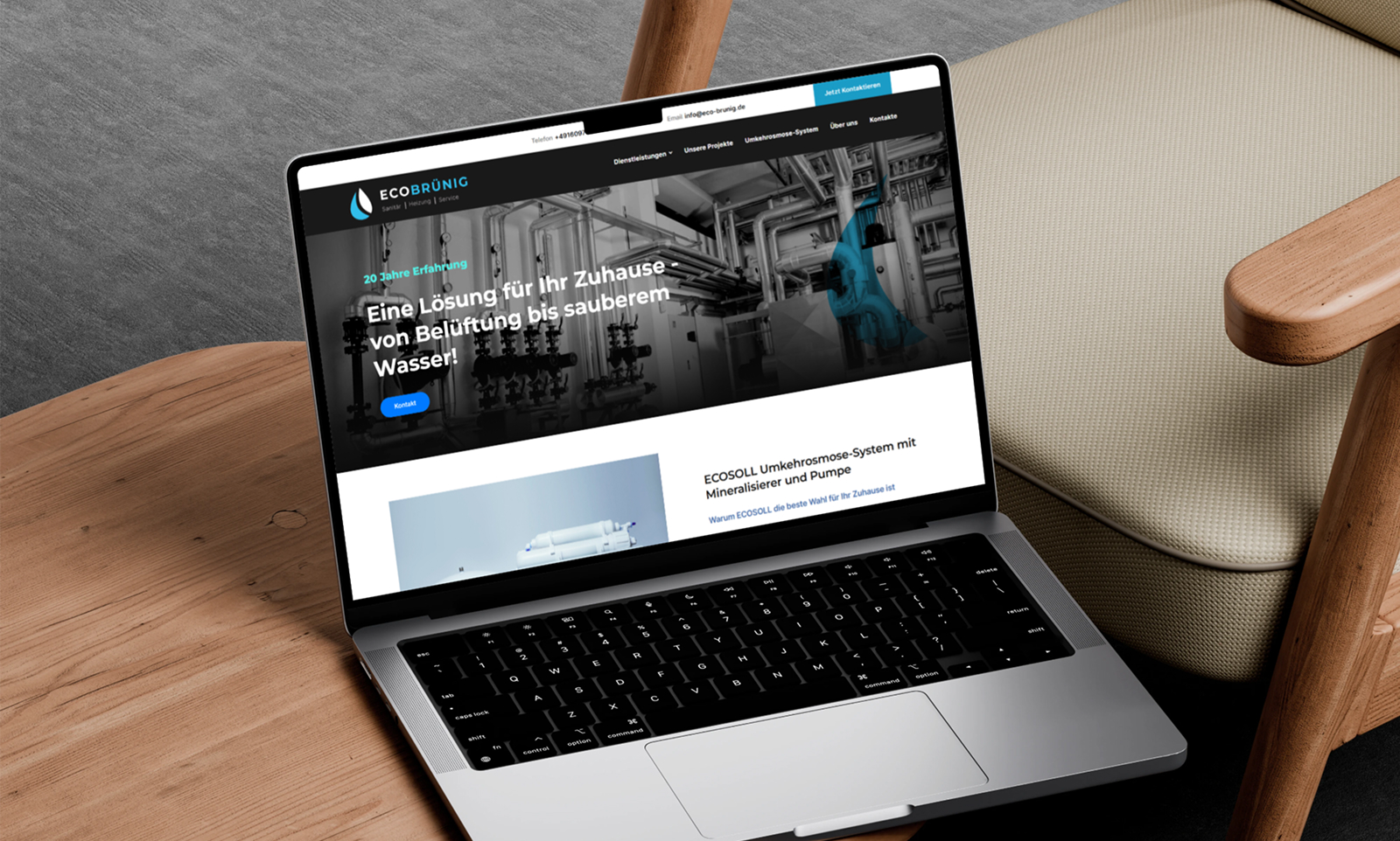
Although the client requested a website that was as minimalistic as possible, I proposed a solution that combined simplicity with modernity. I implemented:
– Clean interface with a focus on structure and content.
– Neat hover effects and smooth animations that don't overload the site but add a sense of “liveliness” to it.
– Visual order and clear hierarchy — thanks to the effective use of indents, typography, and contrast.
– Focus on key services that are important to Eco-brunig customers.
He paid particular attention to adapting to the mentality and aesthetics of the German market, where functionality, trust, and understated design are valued.