Prokoleso — redesign of a tire and wheel online store

Context and challenge

ProKoleso is a Ukrainian online store for tires and wheels operating in a competitive automotive market. The previous version of the site faced several challenges:

– a cluttered interface and outdated visual style;

– complicated navigation within the catalog and filters;

– irrelevant search results;

– poor mobile device optimization;

The main challenge was to retain all technical features and filters while significantly simplifying site interaction and boosting user trust.

Category
E-commerce
Services
UX/UI Design
24

Solution

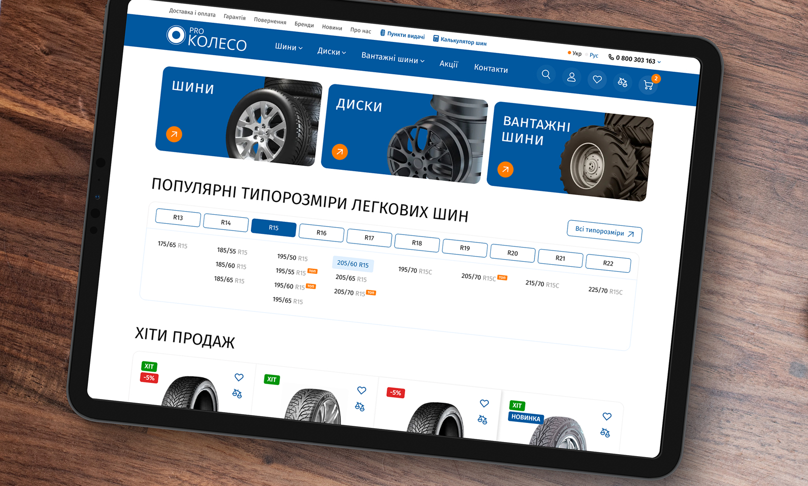
To build an effective UX, I analyzed competitors and the old site version, then segmented users into three main types:

– Those who already know their tire specifications.;

– Those searching by car make;

– Those unfamiliar with the details and in need of assistance;

Based on this, I developed several hypotheses and implemented the following solutions:

– Multi-filter in the catalog: users can choose their preferred search method — by specifications or by car make;

– Restructured catalog: a clear interface with logical hierarchy and fast navigation;

– Added a tire and wheel calculator for users unsure about their choice;

– Emphasized seasonality, brands, and promotions to boost purchase motivation;

– A new UI featuring a user-friendly grid, emphasis on readability, and responsiveness;

25

Result

The updated design made interacting with the site much easier, clearer, and faster:

– The average product search time decreased by 40–50% according to UX testing.;

– A catalog with intuitive navigation, making it easy to switch between product categories;

– Interactive tooltips and a calculator that assist newcomers;

– A clean, clear UI focused on readability, logical block organization, and responsiveness;

26

Mobile version

In the mobile adaptation, I retained full functionality while redefining priorities:

– Filters were separated into a dedicated element with a prominent button for quick access to needed options.;

– Focused on clarity, a large clickable interface, and strong contrast between elements;

– The mobile version was tested independently, showing that users could quickly find products without assistance.

27

Summary

This project was an exciting UX challenge: to preserve extensive technical functionality without sacrificing user simplicity. I transformed a complex interface into a logical, easy-to-navigate system that can be scaled for other automotive products.

The interface has become a proactive sales assistant.