TILKYTAK RECORDS is an independent recording studio specializing in music releases on physical formats and recording artists in-house. The team consists of creative perfectionists with a clear artistic vision and a desire to break away from standard solutions.
The project involved their in-house graphic designer, who closely oversaw every stage—from visual style to layout and spacing.
The main challenge was to strike a balance between the label’s aesthetics and user-friendly interaction.
There were many “wishes” uncommon for a typical e-commerce structure: element placement, animations, and typography choices. It was important to preserve the studio’s character and feel while maintaining usability.
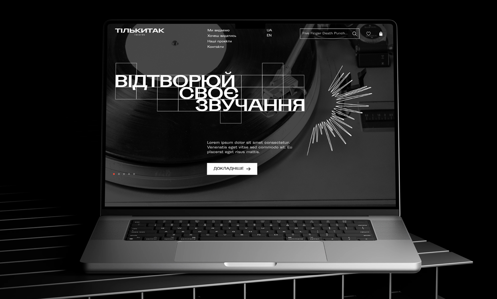
The core idea was to translate the feeling of music into a visual space. The website was meant not just to inform or sell, but to set a mood, create an atmosphere, and evoke emotion.
I combined the aesthetics of analog sound (vinyl, textures, grain, “dust” in photos) with modern typography, rhythm, and smooth animations to create a “visual listening” experience.
Key principles I applied:
– Breaking away from templates: the site structure defies traditional e-commerce logic. – Instead of uniform cards and grids, it features expressive layouts reminiscent of posters or album covers.
– Typography: large headings, unconventional text placement, and emphasis through fonts. All of this creates a sense of dynamic rhythm.
– Clarity and breathing space: plenty of room with minimal distractions. This allows users to focus on the music and sense its character even before listening.
– Atmospheric animation: smooth reveals, subtle vibrations, and contrast shifts—all serve to convey the mood.
This is not just an online store—it’s a visual translation of the label’s sound and philosophy.
The clients received a website that reflects their sound and philosophy. It’s unconventional, lively, and “warm”—just like the music they produce.
Despite numerous requests and unconventional elements, the website:
– is user-friendly (clear navigation, structured content),
– responsive and easy to use on mobile devices,
– features a recognizable visual identity (graphics + animation + typography = a unified style).
The website is fully optimized for mobile devices. I adjusted element placement, typography, and visual rhythm for comfortable viewing on any screen.
I preserved the brand’s visual character and made the navigation intuitive, allowing users to easily explore releases, learn about the label, and make purchases from their smartphones.
This project taught me even more about:
– balancing the client’s creativity with effective UX solutions;
– explaining and justifying design choices when it comes to unconventional approaches;
– collaborating with a team where every member has a strong vision.
The result—a design that resonates as vividly as the studio’s music.